

- 01326 375705


5th April, 2014

We all know, roughly, that correlation and causation do not always provide the expected outcome. The premise is simple: you take two variables, enter them into a graph and voila, the graph expressed provides you with your information, complex or not. Correlation and causation is an ideal method for analysing and presenting any number of complex interacting variables by way of providing a visual representation of any relevant connections between inputs.
Except for when it doesn’t.
In some cases using completely legitimate data can cause statistical anomalies that generate interesting outcomes that whilst the numbers match, the data type doesn’t. Here are a few of my favourite examples where correlation most likely (caveat!) does not equal causation:
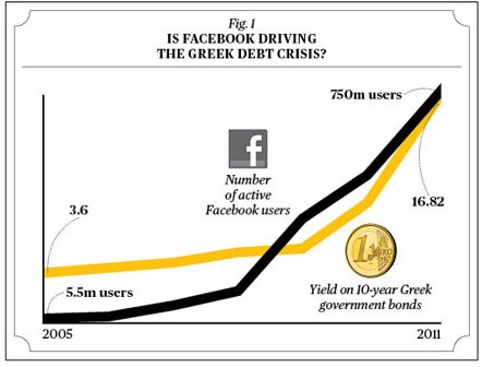
#1: Is Facebook Driving the Greek Debt Crisis?
Obviously not, but how compelling is that graph? It presents the Greek government bond yield correlated with the equally exponential rise of Facebook users. If presented without any further information, it could be taken as an effective causal relationship (but most likely really shouldn’t).
#2: As Global Pirate Numbers Decrease, Global Temperature Increases
Possibly my favourite, implying that we should all reach for the rum and cutlass and begin running amok in the street.
#3: Internet Explorer Usage vs. United States Murder Rate
I believe this says it all, and is perhaps something we can agree with. The frustrations experienced whilst using IE are substantial. It stands to reason that the rate of murder would drop with usage.
Outstanding reporting from Bloomberg, illustrating the problem with announcing that correlation has been found between two factors. Without causation, it could be absolutely meaningless.
#5: Autism Prevalence and Organic Food Sales
An outstanding logical fallacy. As the data is presented in a meaningful manner, accompanied by the creators data sources, this coincidental data could be used to subvert those wavering on a difficult topic for some (vaccinations).
All of the above expose how relationships between variables can be presented in a logical manner as a potential hypothesis. It relies on the user to discern any tangible relationship between the variables and thus make their own calculations into the validity of the information. Most researchers would immediately identify a randomised controlled experiment to expose any potential errors, and I am sure many would just write the information off completely. But it also illustrates how easy it is to infer specific causation. As we relate to causality through experience and our current life experiences are rapidly expanding to understand our effect on data, and as we produce and consume more and more, we should be aware of how that is presented back to us.